.png)

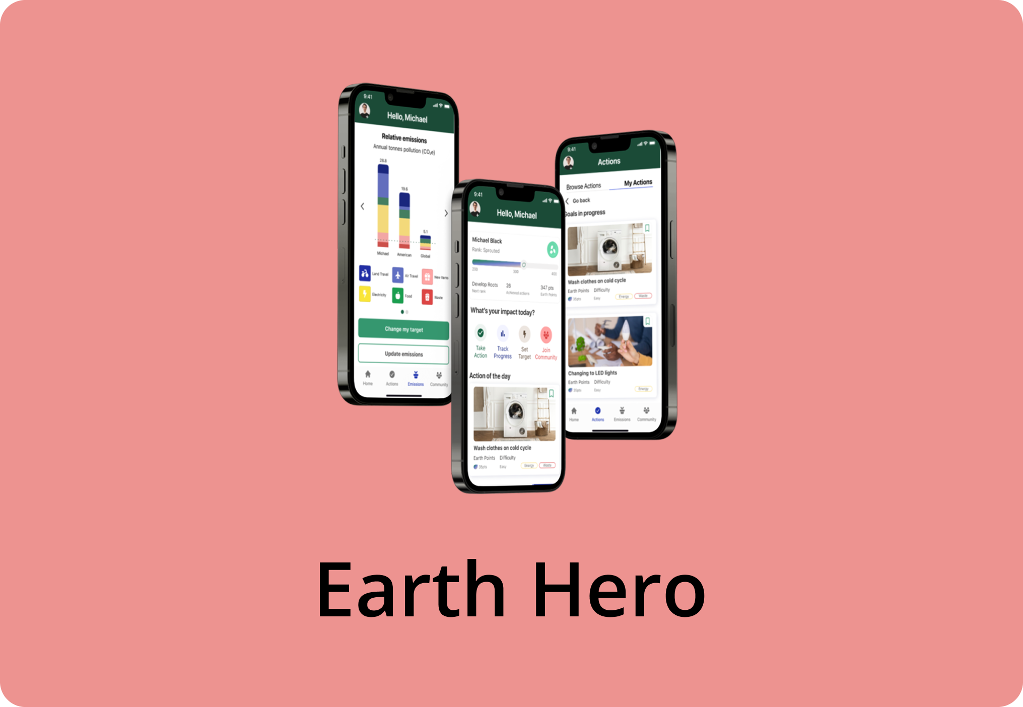
When a concerned mother approached our team about her child with ADHD struggling to learn math, she shared how existing apps on the market came with limitations that hindered, not helped, children like hers. The current math curriculum taught in schools was also found to lack sufficient methods and resources to effectively teach children with ADHD, causing many parents to rely on external math applications. As the lead UX Designer, I collaborated with designers, researchers, content writers, and strategists to bring her vision to life by creating phase 1 of an inclusive math app from the ground up for children with diverse learning needs. Our research revealed that competitors lacked proper accommodation and customization options, two features we made central to our design. I led a team of five designers in transforming insights into intuitive interfaces and engaging content, resulting in a 100% satisfaction rate during user testing for both onboarding and guided multiplication lessons.
The math curriculum in schools is often designed for the general population, overlooking the unique needs of children with ADHD, leaving them feeling lost, helpless, and unsupported. Our SWOT analysis revealed that existing math apps also had critical flaws, particularly a lack of support for different learning styles such as audio-based or visual-based learning. These gaps, categorized as missing customization and accommodation features, negatively impacted the learning experience for children with diverse abilities.
Using insights from our SWOT analysis, I designed phase 1 of a math app for children with ADHD that addressed the two most critical gaps, Accommodation and Customization features, highlighted in the weaknesses section. These categories represented the lack of support for diverse learning styles, such as audio-based and visual-based instruction. I created dedicated screens, including a customizable user dashboard and adaptive lesson modules, to directly support these needs. Features like audio narration, visual cues, and pace control helped improve engagement and clarity. User testing with children diagnosed with ADHD confirmed the effectiveness of our accommodation and customization features, resulting in a 100% task completion rate during the multiplication lesson and enthusiastic feedback from both children and parents.


To identify learning platforms that teach math to children with ADHD, along with their accommodations and pain points included in the design, I created a SWOT analysis on 12 competitors. Using the SWOT analysis, I created a summary using affinity mapping techniques to find common themes.
Across the 12 competitor apps, the most common and high-impact pain points centered around missing accommodation and customization features.
.jpg)
The design team collaborated with the research team to validate the insights we obtained from our competitive analysis with their data found through their user interviews. During a prioritization workshop with the strategy team, the design team identified the following key features for the scope of Phase 1:
Based on the collected information, I designed a basic Information Architecture for the app to provide context for our user flows using the four key features identified.
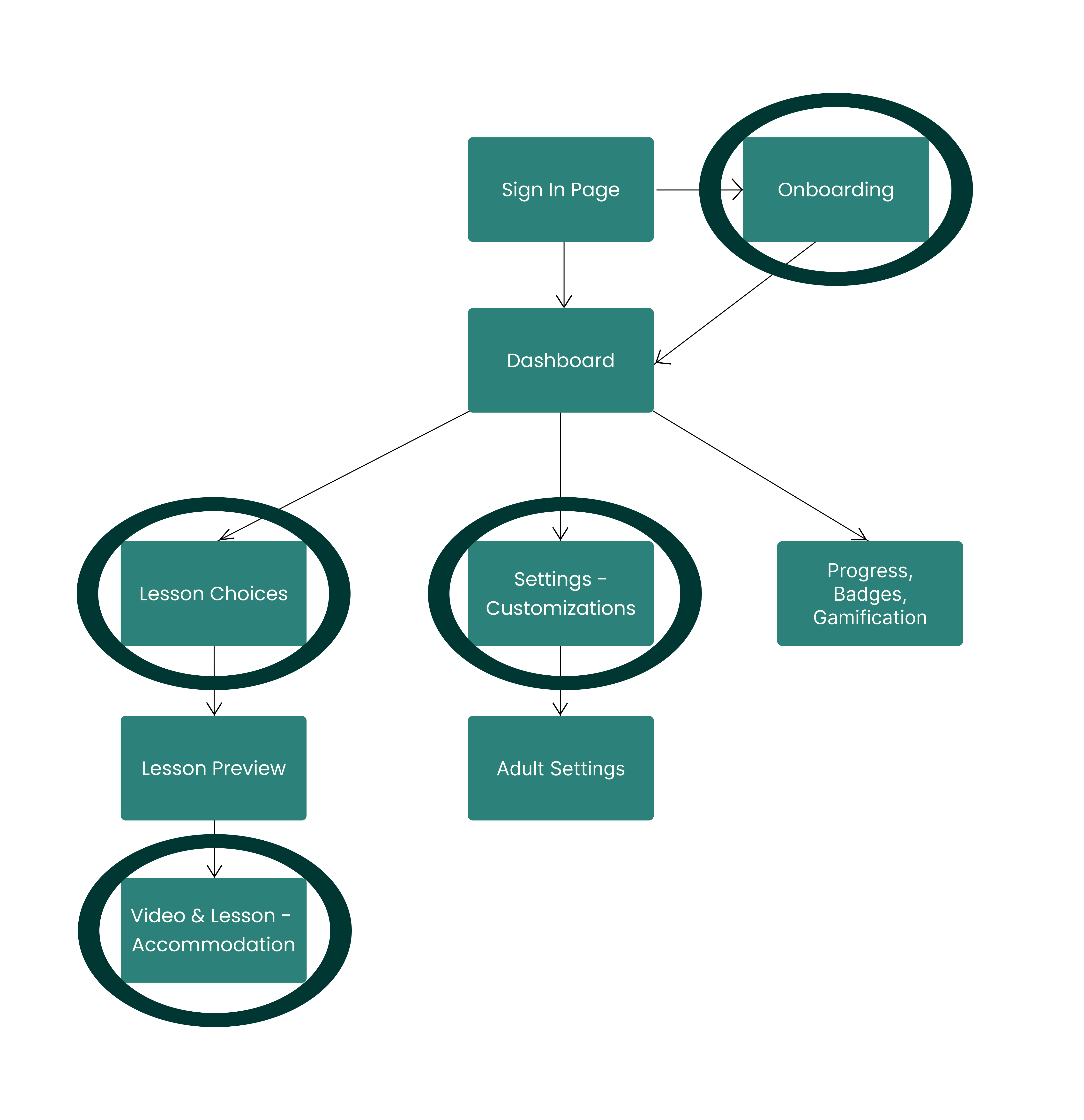
During another workshop with the strategy team, the user flows the design team created containing the four key features, were approved which allowed us to proceed to designing the Lo-Fi and Mid-Fi wireframes.
The designers and I came together during design workshops to design low-fidelity wireframes based on the four features mentioned using best UX practices. We developed mid-fidelity wireframes by placing more attention to creating a consistent layout.


Once we had a clear understanding of the market, identifying what to emulate and what to avoid, I structured our vision around a set of Accessibility Guidelines and Pedagogy Standards. These were informed by our SWOT analysis, secondary research, and the valuable insights of designers on our team who were also experienced school teachers turned UX designers. The Accessibility Guidelines and Pedagogy Standards are:
Using secondary research we obtained from the research team, a UI mood board for a math learning app for children with ADHD should balance focus and engagement through calm, accessible design. It should include a soothing color palette with selective bright accents, clear sans-serif typography, and minimal, friendly illustrations that support learning. The layout should demonstrate structure and white space to reduce cognitive load, along with examples of subtle animations, progress cues, and inclusive accessibility features. Overall, the board should convey a tone that feels calm, encouraging, and rewarding while adhering to WCAG standards.

Using insights from our competitive analysis, accessibility and pedagogy research, and the expertise of our teacher-turned-designers, I designed multiple approaches to teach multiplication problems. Each approach was reviewed and refined by our content writers to ensure the language was clear, engaging, and appropriate for our young and sensitive user group.


We initially created a style guide that contained more soft tone colours, however after reviewing Research's data indicating that children prefer darker shades of colour, we decided to swap the softer colours with a darker shade.
.jpg)
By applying pedagogy and accessibility guidelines, I created our finalized style guide for our wireframes and build additional screens to develop a cohesive high fidelity prototype which were validated by the research, content, and strategy teams.
A Usability Test was conducted to evaluate the prototypes of the onboarding screens and the guided lessons of multiplication with children and their parents by the research team and accompanied by the design team. The goal was to ensure that the app is accessible and user-friendly for children with varying levels of cognitive ability and learning styles.
The user testing had a 100% success rate of completing the onboarding process and the guided lessons of multiplication, using their preferred method, amongst all the children and the parents who guided them.