Help & Feed Campaign

Designing a website for a campaign that resulted in a 14% increase in donations and user engagement
A laptop screen showcasing the Help and Feed homepage.
Role
Lead UX Designer & Researcher
Team
Lead Developer
Project Manager
Skills
Competitive Analysis
Lo-Fi Wireframes
Hi-Fi Wireframes
Style Guide
Timeline
2 Weeks

PROJECT OVERVIEW

Sai Dham Food Bank- Help & Feed Campaign

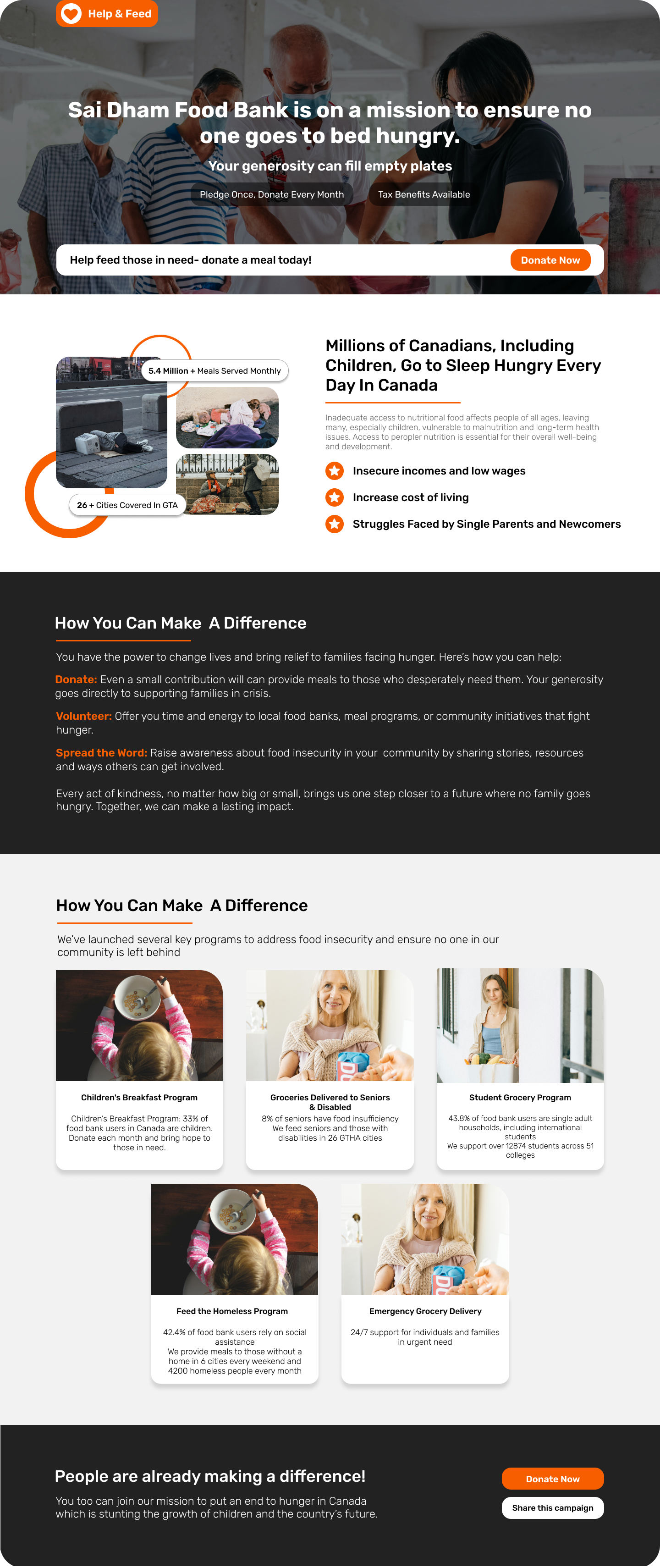
Sai Dham Food Bank, a nonprofit dedicated to feeding vulnerable communities, operated five programs supporting seniors, children, international students, the homeless, and emergency food assistance. Facing a financial shortfall that threatened program sustainability, the organization launched the Help & Feed Campaign to increase website traffic and raise funds. The campaign was promoted on the food bank’s website to drive awareness and donations.

the problem

What was going wrong?

The campaign on Sai Dham Food Bank’s website lacked website traffic and failed to generate sufficient donations, necessitating a dedicated campaign website to enhance awareness and increase contributions within 2 weeks.

SOLUTION & IMPACT

How did I bring more website traffic and donations to this campaign?

As the UX Designer, I designed a dedicated campaign website that streamlined the donor journey, showcased donation impact, and increased donations and user engagement by 14%.
An image of the Help & Feed website's homepage.
How did I design this website for Sai Dham Food Bank within a two-week deadline?

PROBLEM BREAKDOWN

What were the goals to solve this problem?

During our kickoff meeting with the project manager and developer, it was stated that this campaign website had two clear objectives:

Money icon
1.Increase donations
Simplify the process
A detailed sheet icon
2.Program impact
What the donation will provide

RESEARCH

Competitive Research

I conducted a competitive analysis to make informed key design decisions by identifying gaps in the food bank’s existing website and outlining must-have features for the new campaign site using competitors who are also using a donation-focused platform.
Competitive analysis of Sai Dham Food Bank and its 3 competitors.
Key Features
The key features in this design are based on insights from the competitive analysis. During a meeting with the project manager, Trust indicators, transparency and communication, and clear calls to action, were identified as the main gaps and will be prioritized. While there are also issues with responsive design and UI on the current website, those will be addressed as part of standard UX best practices.
A hierarchy icon
Clear Program Impact
Dedicate sections to each program, highlighting their purpose and measurable impact
An icon showcasing a list in chronological order.
Simple donation flow with CTA
Prioritize an easy-to-use donation process with clear calls-to-action (CTAs)
A shield icon
Transparency and trust
Include transparency elements like testimonials and detailed breakdowns of how donations are used

THE DESIGN PROCESS

Designing key sections of the website based on our two goals

🎯Goal #1 - Increase Donations: Simplify the Process using a 3 step process
During our daily standups, the developer provided insight on the design limitations I had for the donation page since we incorporated Stripe for our payment process within the website. Keeping this in mind, I was able to design the section containing the CTA on the homepage and all of the content to keep the process simple for our users.
Screens showing the hi-fi wireframes
🎯Goal #2 - Program Impact: What the donation will provide
A screen showing the hi-fi wireframe of the program section

Style Guide

The style guide is accessibility compliant, as it follows clear standards for color contrast, readable typography, and consistent layout structures that align with WCAG guidelines.
An image of the style guide used for the redesigned website.

The Solution

During the design handoff, the high-fidelity mockups, design system and prototypes were provided to the developer who then brought this vision to life.
An image of the second half of the redesigned Help and Feed campaign website homepage.

Wrapping Up

Impact

Despite the tight timeline, the campaign website was delivered on schedule and achieved measurable success. Early metrics showed a 14% increase in website engagement and donations, demonstrating the effectiveness of the streamlined design and intuitive user journey.

Learnings
You may also like
Three iPhone screens with images of the Earth Hero app
A laptop with MyDok's dashboard on the screen
 Three ipad screens displaying images of the ADHD Math app.