.png)
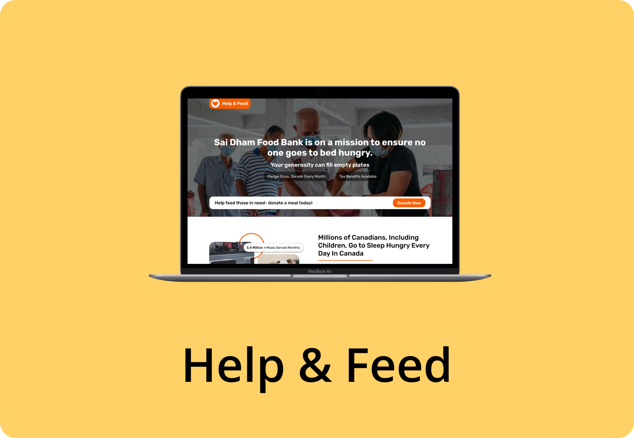
A redesign of Earth Hero’s primary navigation and overall information architecture was necessary to streamline task flows and reduce friction points in the user journey. A UI audit and user testing identified key usability issues, such as frequent task abandonment and high drop-off rates, despite the app achieving a six-week retention rate of 46%, significantly outperforming the lifestyle app industry average of 10%. While retention metrics were strong, the goal was to optimize the experience further by eliminating pain points and creating a more intuitive, task-completable interface.
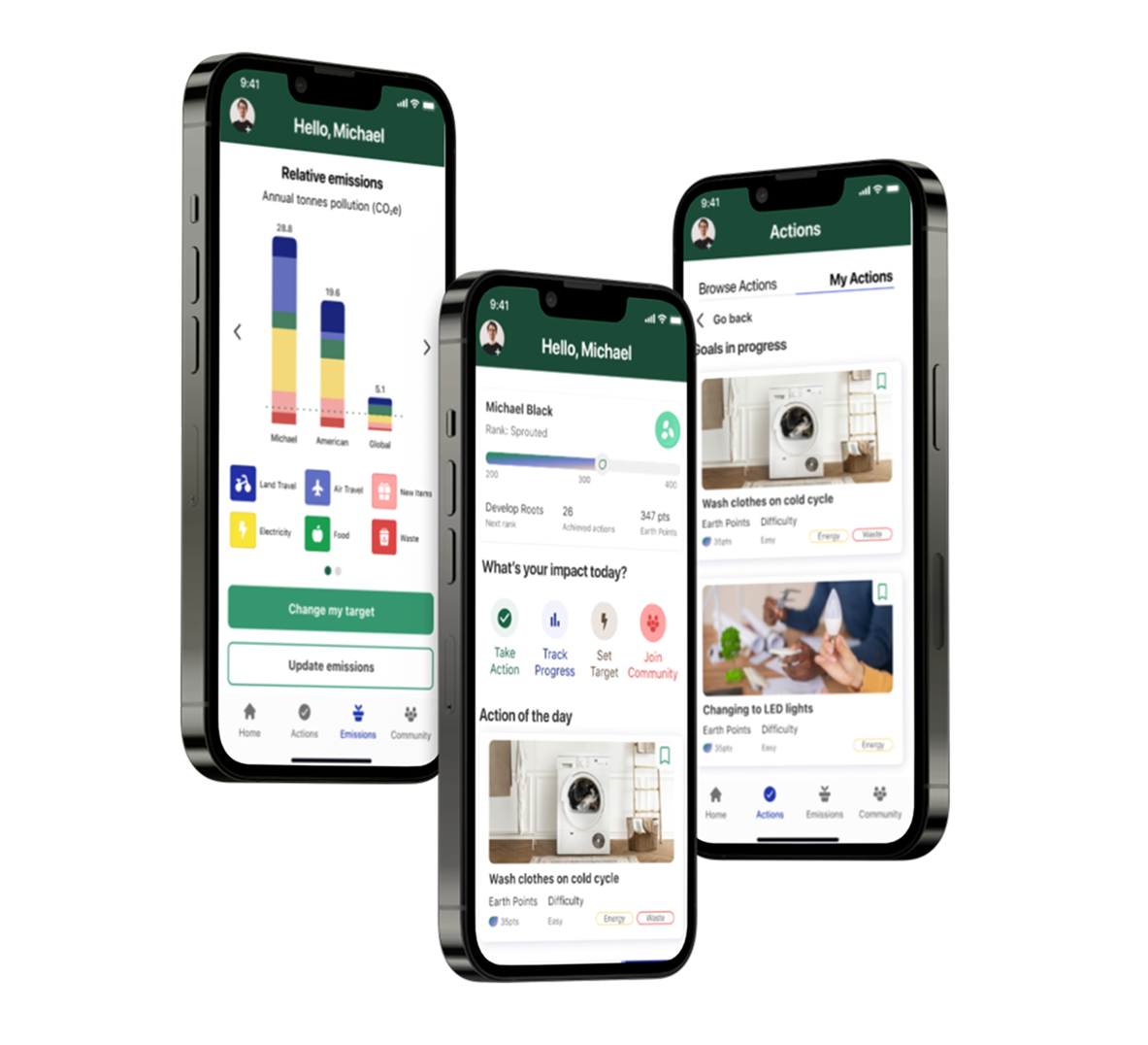
Based on the research, I restructured the app to eliminate 2 pain points around the "My Actions" tab; location of the tab and usage of its features. To eliminate these pain points, the following changes were made:
.png)

Through previous user testing and feedback done by the researcher, it was understood that users were experiencing confusion when beginning a task due to navigational flows and elements that did not correlate with their assumptions and expectations. By collaborating with the researcher and designer who conducted a UI audit, I began to analyze the pain points on each of the main navigation pages on Earth Hero.
.png)

I then created user stories using the pain points to establish what features are needed from the user's perspective. Once the user stories were validated by the researcher, I created user flows for each user story to be sent over to the designer. The designer used the user flows to redesign each screen with its needed feature.
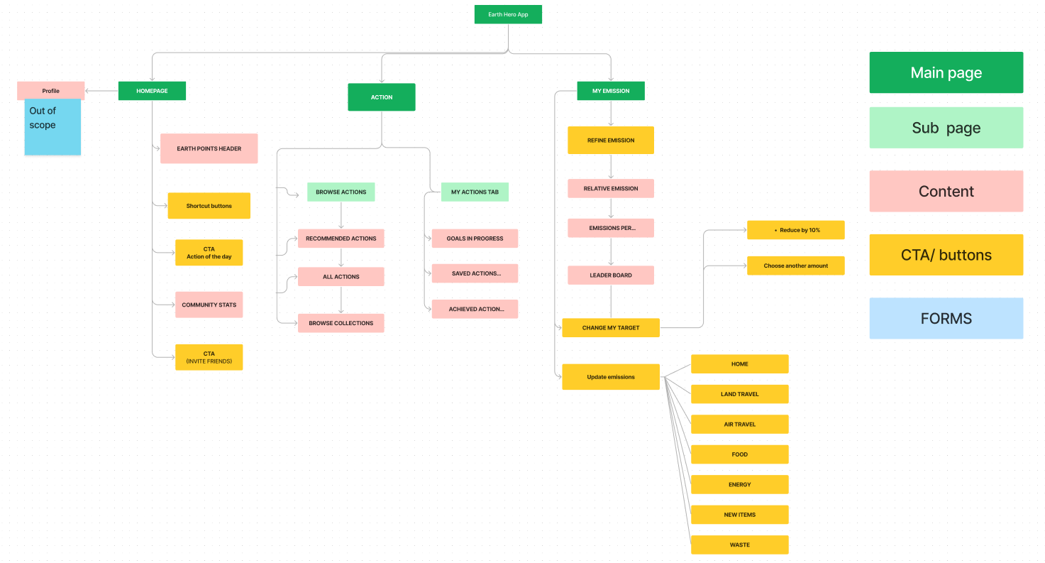
Based on the user pain points identified and the User Stories created, I created a new Site Map to showcase the different screens and user actions that will be prioritized and redesigned for this project. The client wanted the team and I to focus solemnly on the main navigation pages: Homepage, Action, and My Emission, which made the profile section 'out of scope'. Since the current Site Map had the users confused with the "My Actions" tab under the My Emissions page, it caused users to leave the app. To fix this issue, we moved the "My Actions" tab beside "Browse Actions" under the Actions page. The new site map was shared with the design team to guide their designs.
.png)


.png)